
Thursday, 19 December 2013
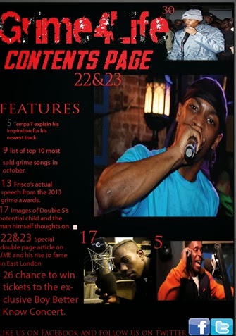
Contents Page
Wednesday, 18 December 2013
Front cover

Wednesday, 4 December 2013
Original Photo Presentation
Here I had to put all of the original photos that I have taken for my music magazine and put them into a powerpoint presentation after this I msut chosoe a select few form these images to use in my music magazine.
Wednesday, 20 November 2013
Photo Planning
The images for my music magazine will be taken in a range of
different backgrounds featuring more than one person with a variety of different
shot types as well as the costumes being rather casual for some. Whereas one or
two of my photos will feature rather hood or gangsta clothing i.e. hats, hoods,
large coats. I will take the photos against rugged walls, corridors and school
playgrounds.
Tuesday, 19 November 2013
Double Page Article
For years the grime music genre has been hidden from the
mainstream music industry and has stayed primarily underground in East and North London where it originated
rarely making an appearance in the music world but still producing grime
artists that literally blow out the mind of those who are lucky enough to
listen to their tracks. One of the best artists that the grime genre has
produced and is making the grime genre known and famous is Hackney born,
co-owner of the record label The Base and all around phenomenal artist Spectre.
Benny Flakes is 19 years old grime artist who was born in
hackney and raised in Tottenham in a council flat with his two parents and his
brother Joseph Flakes AKA Ghost. Spectre graduated from the University of
Greenwich smashing graphic design. After the sensation had finished university
he went on to work for many different companies that wanted his graphic design
skills incorporated into their own creations. Spectre worked for a variety of
graphic design companies such as Mario paint, fruity loops and Gameboy camera
where he did awesome graphic design work which made some of these companies
what they are today. After Spectre was
finished working for graphic design companies he then went on to further his
music career by co-owning uptown records which allowed him to create his own
designed and printed grime t shirts to be sold and purchased
in turn giving Spectre the funds and underground fame he needed to continue
his music career.
After getting the word out about himself he and his brother Ghost
then created the ultimate music group and record label known in the underground
of East and North London as The Base. So now Spectre had a record label and a
clothing chain all before the age of 20 which is an amazing achievement for
anyone in the music game especially for a person who was born in Hackney who is
immediately judged by society as to be a person who does little or nothing with
their life. Now that Spectre had all the pieces in place to start a music
career he began by featuring at a range of concerts as a follow up act and
Djing at various raves and clubs in order to get his name known around the
different ends.
Spectre soon then released his first single known as “More
Then Noise” this was the start of the king of grimes success’s in his career. Spectre’s
songs got fame everywhere in East and North London and soon him and the new
members of The Base were getting hired for concerts and raves
everywhere and rapidly becoming the music group to hire for any occasion.
However Spectre may be a musical sensation in the East and the North but his
refusal to burst into mainstream media with his tracks had led to him falling
short of the number 1 spots in the UK charts. Spectre’s reply to not going main
stream is that he has no need for the fame that it brings to go mainstream and
he would rather keep his music with the fans of the North and East than change
his style of music. If Spectre appeared in mainstream media he would have to change the style of his music
in order to accommodate the mainstreams quota of blurring out what they believe
are inappropriate lyrics. So Spectre staying true to himself has stayed known
as a grime artist loved by the east and the north of London who love his music
and everything he stands for.
Despite this set back Spectre has managed to release a ton
of tracks varying in beat and lyrics never repeating the same bars in any of
his songs and always giving the audience something knew to listen to and what
he does give the audience to listen to is nothing less than utterly phenomenal.
Spectre does not talk about drugs, gangs, knives, guns, girls or even being
better than other rappers all he raps about is his passion for music which is different from the common rapper.
Spectre also made sure
that his record label did not include any rappers that rapped about guns, sex
or gangs which he did very successfully keeping to his own record label style
of not conforming to the black rapper stereotype.
Spectre has allowed quite a lot of rappers to join his and
his brothers record label The Base the current artists and beat makers
that reside under the record label music group The Base are… Spectre, Disco, Ghost,
Scammer, Horty, E_gritz, Solo41, Friskey (on and off), DJJ maximum, D3EKO (occasional work). Spectre and The Base also create tons of songs feauturing all of the members of The Base within the songs which turn out to be the most spectacular tracks you will ever hear in your life. The Base have played in a wide range of areas around the entire country and anyone who sees them and hears their tracks are automatically mesmorised by the style, pace and beats that this group/record label produce.
Spectre has not been involved in any type of beef or
problems with any rapper throughout the rap scene he has kept
his nose clean of drugs and his finger prints off straps he is really a perfect
example of a clean rapper who still produces great music. Although Spectre and
The Base may not want to burst into mainstream media I’m sure they will get
their through sheer determination and still have their epic style of rapping
when they finally do go mainstream. Spectre is a great rapper who destroys
stereotypes and has worked his way up to the top through sheer hard work and
sick lyrics we believe one day he will be known by the whole of the United
Kingdom rather than just two areas of London because his music is GHOSTLY BLUD.
Thursday, 14 November 2013
Front Cover Artist Plan
The name of my artist that will appear on my front cover
will be the artist known as JME who is the leader of the music group and record
label Boy Better Know situated in East London.
JME is a 28 year old music artist who was born in Hackney
with both of his parents being Nigerian born he is situated mainly with music
genre known as grime. He co owns a music label known as Boy Better Know with
his older brother Skepta. JME studied Graphic design at the University of
Greenwich and worked for several graphic design companies such as Nintendo. JME
for a few years worked as a solo act before creating his co-owned record label
but for some reason JME does not want fame as he has said so in various
interviews and radio shows he is just in it for the music which is just one of
the many things that makes JME an inspiration in the grime world.
I will represent my artist through various images
accompanied by text and keywords from his various songs in order to highlight
how good of a rapper JME really is. I will also represent JME as humble through
the text and not really a rapper looking to seek fame and money but a rapper
who raps just for the pleasure of hearing his own music unlike other rappers i.e.
Eminem, lethal b etc. When writing articles and sections about JME I will be
sure to use informal style language because JME’s personality itself is not
formal in the least so informal language suits the article better for JME.

Contents Page Mock Up
Front Cover Mock Up

Thursday, 7 November 2013
Mood Board
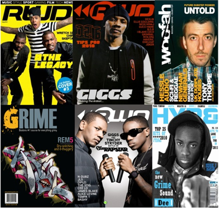
In these front covers the main artist with the double page
article is shown in either the middle of the front cover or seen taking up the
entire front cover looking at the camera to make out as if the artist in the
image is looking directly at the audience in order to attract the eyes of passer-by’s.
in almost all of the music magazines front cover in this mood board all of
them are wearing generally dark colors
on their costumes this is used in order to covey grimes music genre as unknown
and quiet and not loud and proud like pop or RnB distinguishing the genre from
other music genres. Overall the artists in these magazines are represented as
cool and collective and quiet all apart from the RWD magazine front cover in
the top right where the artists seem to be excited but apart from that magazine
cover all the other magazine covers perfectly represent grime as a calm genre
that is quite unknown and does not have artists that look for fame unlike pop
and RnB. The fonts in the title blocks of these magazine covers are very
similar in appearance, they use bold large text with either two colors or one
color throughout the lettering which further relates to the simplicity of the
grime music genre also these title block lettering have subtle altering to
specific letters to highlight them such as the G in the bottom left grime music
magazine and the R in the 2nd RWD magazine. The color scheme for
these grime magazines are seen generally to be a dark color followed by a
bright color in order to balance the darkness out and give the magazine a
brighter outlook in order for it to be
recognized by the masses that may
glance upon it on a magazine stand. By looking at the front covers of these
magazines us as the audience can infer that the articles in these magazines
will be focused on grime artists or more specifically the grime artists that
were featured as the central image on the front cover so we can also expect
informal language being used in the articles because of the type of artists
that are seen on the front cover.
Tuesday, 22 October 2013
Tuesday, 15 October 2013
Title Block Designs

Design 2
.png)
.png)
.png)
These
are my 3 designs for my music magazine centered around the music genre known as
grime with the results from a pole on which title will be best for a music magazine about grime i will use that title in my music magazine.
After the poll the design that got the most votes was seen to be design 2. I have chosen design 2 as the title block and color for my magazine title mainly because of the audiences love for it shown with the mass of votes that were placed on design 2 as a suitable for a music magazine about grime music. i also choose design 2 because the design of it shows th genre of music grime so well through the scraped off lettering and miss matching colour which relates to grimes edgy appearance and sound.
After the poll the design that got the most votes was seen to be design 2. I have chosen design 2 as the title block and color for my magazine title mainly because of the audiences love for it shown with the mass of votes that were placed on design 2 as a suitable for a music magazine about grime music. i also choose design 2 because the design of it shows th genre of music grime so well through the scraped off lettering and miss matching colour which relates to grimes edgy appearance and sound.
Title Block Analysis
From looking and
reading this title block you can tell that the magazine this title belongs to
genre is rock and pop music. This is because the name rolling stone refers to a
rock and pop concert held annually in the United States of America so it is obvious
that this magazine genre may be rock and pop music.

The colours in the title block tell me that this magazine
may be rated or have a target audience of people aged 17 and over. This is
because the colour read is normally associated with sexual or red hot content
unsuitable for viewing of minors.
The font used here tells us that the magazine is rather old
and may feature old artists this is because the font he is really old a bit
like 1970s font curved and slightly slanted which gives the impression of old
content.
The title itself tells me that this magazine is a music
magazine because of the style of the title and the title itself which gives the
impression of 1970s music through the sheer appearance of the title itself.
The title gives me information that the target audience for
this magazine might be young adults aged 22 to
30 who remember music in the 1970s or so and want to read a magazine
which still features the classic bands and singers of the past the title gave
me this idea through its 1970s style of text and font.

You can’t really tell what the genre of this magazine is
from looking at this title mainly because the title is very concise an simple
with only one letter and that letter is Q so to be able to know what genre this
magazine is form just looking at this title isn’t possible.
The colours in the title tell me that this magazine wants to
attract the attention of passerby’s this is because of the use of bright and
vibrant colours such as red and white which really stick out in a magazine
front cover and so catches a passersby’s eyes and interests them.
The font used here is a large white Q which really does not
tell you much about the genre of this magazine or about the magazine itself as
a whole so it really does not really create meaning other than that this
magazine might be quite simple seen through the simple title Q.
The title itself does not really tell me anything about the
magazine other than the magazine might be quite simple and its text might not
be too complicated which is inferred by the simple one letter title Q.
The title tells me that the target audience for this
magazine may be 18 to 23 year olds who want a simple magazine which is not cluttered
with useless annoying text, big buzz words and fake competitions just a simple
magazine containing simple yet well written stories and articles.

From the title I can tell that the magazine this title
belongs to is a music magazine with the music genre known as heavy metal.
The colours in this title tell me that they have been used
in order to make the white lines in the lettering stick out more in order to
draw the attention of possible readers who may get attracted to the style of
the title thus increasing the number of readers and purchases.
The font of this title is large and shattered this tells me
that this magazine is a music magazine of the heavy metal genre as seen through
the cracks in the lettering and the large font which can be associated with
loud music through its style. I believe this title creates the meaning of heavy
metal being extremely loud as seen through the style of lettering that shows
various cracks implying that heavy metal music shatters windows or glass in
general.
The title “KERRANG” itself tells me that this magazine is a
music magazine centred on the loudest music genre known as heavy metal. The
title also tells me that this magazine will have a lot of content about heavy
metal bands or solo artists as well as a lot of content that figuratively jumps
out of the page through the use of large font and style which can all be
inferred from the title.
This title gives me information and tells me that the target
audience for this magazine maybe 16 to 22 year olds who enjoy and listen to
heavy metal music regularly and want a magazine specifically for the heavy
metal music genre which suits all their needs in terms of finding out the
latest news and albums from the favourite heavy metal bands and solo artists.
Thursday, 10 October 2013
Final Magazine Proposal
In my final magazine proposal I have concluded that my
magazine will be called Grime4Life and the genre of my magazine will be
a mainstream magazine based on the music genre known more commonly in the East
London as grime. I have chosen this genre of music because it is not well known
in all areas of the world so it is a unique magazine with a rather unique and unknown
music genre which sets it apart from all the other mediocre magazines already
out there.
My target audience for my magazine will be youths aged 15 to
21 both male and female who can afford magazines that have quality well founded
information within the pages. Also my target audiences overall socioeconomic
place in society will generally be middle and lower classed people because they
are most likely to already be associated
with grime music because of their place and class being so close to the grime
genres heart.
I have also concluded that my magazine will be published and
released to the public monthly. This is because it gives me enough time to
gather enough information, facts and stories about artists and grime music so
when I do publish my magazine it will have a good amount of information and
text for my readers to enjoy. Also this lengthy time period also gives fans of
my magazine something to expect and wait for so my magazine readers will wait
anxiously for the next issue each month allowing me to keep my current readers
who may also refer my magazine to their friends, peers and colleagues.
I have decided to create my magazine because the grime genre
of music is not well known throughout the United Kingdom and there are few
magazines out there that even have grime content within them, because of this I
saw a gap in the market for a music magazine centred all on grime music,
artists and news. I also decided to create this magazine because grime music
also represents the lower and middle class of our society and I believe these
classes are represented through grime music and deserve to have themselves recognized
by the upper class and the rest of the world through any type of media.
In my music magazine I will include a variety of articles
and content in order to ensure my readers remain interested in reading my magazine.
In my magazine I have decided to include articles about existing and famous grime
artists such as JME and solo 45. I have also decided to include competitions in
my magazines in order to attract readers and give them a chance to win prizes
such as gig tickets. I will also include freebies in my magazines which will
also entice readers to read my magazine for the promise of free goods. I will
also include double page articles in magazine which hold detailed information
about topics that concern grime. Finally I will include a lot of buzzwords,
title block, anchorage text, puffs and images for my magazines front cover in
order to make my magazine look friendly and formidable for readers to see when
they pass a magazine stand.
The ideologies that my magazine will promote will be that
grime music is not as bad as it may sound by its name because when people hear
the word grime they automatically imagine disgusting or filthy but my magazine
will change that and it will change the opinion the upper class has on the
lower class and middle class families who are most associated with grime music
and are judged in the same way as this genre of music.
I will use a variety of techniques to attract readers to my
first issue. I will use techniques such as buzz words and anchorage text the
buzz words will attract people to my front cover with words like WIN and FREE
in big title block in order to get people’s attention with a chance to obtain
free goods, whereas the anchorage text will give information about different
grime artists and stories within the magazine which may interest people when
they look at the front cover.
I shall also use techniques such as the use of title block
and images to attract readers to my first issue. The title block I will use
will be large and brightly coloured this will attract people to the magazine when
they see it because it is easily noticed and may lead to readers picking up the
magazine via the interest in the bright colors and large font. While the use
of images will attract readers because they may see artists on the front cover
that they know or enjoy so this may soon lead to them buying the magazine in
order to see if there is an article or section about that particular artist
within the magazine itself. Below is a character profile of a typical buyer of my magazine.

-
Name:
Jerome Holder
-
Age:
16
-
Occupation: Student
-
Interests/Hobbies:
Listening to music, playing Xbox 360, surfing the internet and watching
television.
- Ideologies: Not all people that are lower or middle class are bad people no matter how they appear in the news or how the police portray them.
- Ideologies: Not all people that are lower or middle class are bad people no matter how they appear in the news or how the police portray them.
Tuesday, 1 October 2013
Focus Group Questions
This is the introduction to my focus group with the names of those who are present.
Here i asked the first question which was should a music magazine be serious or fun?
In this video i asked the question who should be the target audience for a music magazine about grime.
in this video i asked my group do you think that £3 for a music magazine is reasonable and everyone but Heera gave answer.
in this video i told my group that my magazine will be coming out monthly and then i asked for there thoughts on this.
Here is the final question of my focus group and the conclusion here i asked my focus group if my magazine should be accessible online.
My focus group gave me a variety of answers to my questions that i asked and some answers which contradicted the other answers they that have been given by other members. Overall the answers i got from my focus group has been very helpful during the first stage of creating my magazine.
Monday, 30 September 2013

Institutional Research
 The Bauer media group is an institution that is centered mainly on spreading media throughout the nation. The media they spread is mostly music varying in all different types of genres and styles and spreading them throughout the airways through radio communications and through music magazines that they create and sponsor themselves.
The types of magazines the Bauer media group produces are mostly music and radio magazines that vary in different music genre. This is done by the institution to widen the target audience of their magazines and increase the number of purchases for their magazines by creating magazines that suit different people’s needs across the nation more money can be made because the target audience for the many different magazines have been satisfied.
The magazines that the Bauer media group produce are a bit of mainstream and a bit of niche magazines with some magazines centre on particular genres of music and some that are centred on completely different topics such as bikes, cars and even bird watching once again increasing purchases and widening the target audience accordingly.
Bauer also gives people that need jobs a chance to apply for a job in advertising and earn some money. This job offer is centred on advertising Bauer online through the creation of online adverts and webpages created specifically for the advertisement of Bauer. This gives unemployed people who are skilled on the computer a chance to have a job advertising for a large institution and get paid for it in the process.

The majority of this institutions target audience is made up of a variety of targets but mostly those who read and like to find out about what is going to happen next week in their favourite soap operas and sports magazines fans who want to find out what’s new with the athletes and players that play that particular sport or participate in that particular event.
IPC media are linked to other advertising types of media which allows them to advertise themselves and their magazines or partner brands in a wide range of media products used in order to attract people to their products and increase overall purchases in order to make a profit.
The other types of media immediate media own are actually television channels such as the toddlers and babies channel known famously as Cbeebies and they don’t only own their own television channel that thousands watch they own their own sponsored and created television shows such as Octonaughts that feature on their channel Cbeebies. These different types of media aim to suit the various needs of various target audiences across the nation which means immediate media will gain an even bigger income from their works in the media industry.
 Development Hell is a solo institution based in Islington in the United Kingdom. Development hell owns their own media products and tools and do not sponsor or invest in any other type of media created by others. So far Development Hell owns their own self-proclaimed magazine that was supposedly voted the biggest music and dance magazine in media itself. By allowing there magazine to satisfy two different genres Development Hell has increased their target audience range and thus increased the sales made from this tactic of satisfying a multitude of peoples need through genre splicing.
Development Hell has also worked with apple to create an app exclusively for the IPAD centered
around the magazine they own known as miximag this app that they created allows users to view the magazines online whenever they want to and at wherever they may be giving people the freedom to choose when they view there magazine and having choice to do so where they may be.
Questionnaire Answers Analysis

In this question the answer that got the most amount of vote
was answer two with this information I can incorporate this result into my own
magazine making sure to feature a good amount of text and images about
different genres of music and artist’s.

With
this question the answer that got the most votes here was the second answer and
with these results i know that i need to include a myriad of bands and artists
accompanied by anchorage text, puffs and other magazine front cover layout
features.

With the results of this question i can possibly make my
magazine specifically centred on either Rock/Indie music or Hip-Hop or even
create a magazine with a mixture of both a hybrid genre of Rock/Indie and
Hip-Hop in order to suit a wider audiences needs.

With this questions results i can improve my magazine
greatly so to ensure that my magazine is read by multitudes because as shown in
the results many people don’t even read magazines which mean the time and
effort put into music magazines needs to be increased in order to increase the
number of readers.

From
these results i can incorporate the information and include it in my own front
cover. With these results I will include
gossip about artists and include vibrant eye catch colours on the front cover
accompanied by text.

With
this mixture of results I can include information about artists from these
highly voted music genres in my magazine in order to suit a wider target
audience rage and attract more readers to my magazine.

What i can take from these results is that when i create a
double page article i should make sure the topic is centered on one particular
artist with some images and a character file or bio for those who do not know
the artist.

With
these results that answer 3 ranked the highest in i can create with confidence
a contents page that has a certain number of images in random locations with
text and page numbers describing the articles within.

With
the results from this magazine I can make an educated choice weather to price
my own music magazine at the price of below £2 or £2.99 giving me a fair price
range to work out and use as my final price for my music magazine.
Monday, 23 September 2013
NME double page article analysis

In this double page article the artist featured is Tyler the
creator this tells us that the target audience for this double page article are
hip hop music fans and fans of Tyler the creator himself females and males
alike. The language used in the magazine is mostly offensive and aggressive
phrases such as “fucking boredom” and “Goblin is still the shit” tells us that
this magazine article can be aimed at a younger audience who are most commonly
are seen using such language and thus will understand what Tyler the creator is
saying in this double page article more so than an adult would understand which
also tells us that the style of this magazine is mostly about the cool music
stars in the world and what they say, do and how they act.
Not much colour is used differently here besides the red
coloured section on the second page of the double page article giving the
audience a quick background check of Tyler the creator in case they don’t know
who he is or where he came from. The style of text used in this double page
article is mostly standard text and font varying from small letters to capital
letters when there is a point to be made in the article and to create effect.
The double page article’s layout spreads text in columns below
a few images that are put there and link to what is being talked about in the
double page article itself this is done to give the audience a visual image
about what is being talked about in the double page article. The double page
article is also laid out with a coloured red section that mentions the artists
full bio completely unrelated to the actual story in the article and is placed
there just for future reference.
The majority of the pages of the double page article are
taken up by text while the remaining majority is taken up by the images as seen
simply by looking at the double page articles layout.
In the double page article the text doesn’t address the user
directly or even indirectly because this double page article is centred on the
artist’s current and past life so the audience only reads
and gets information on the artists life and not much else.
In this double page article the artist is represented as a party
person, king of hip hop and a very social person. We see him as a party person
from the two images of him having fun and partying on stage and joining in with
the crowd. We see him portrayed as a king of rap through the picture of him
with a crown and jewellery on suggesting to the audience that he is the king of
hip hop music as seen from the props he using in the image. Finally we see
Tyler as a very social person through the remaining images of him with people
who appear to be his friends in many of the images Tyler and these people are
seen smiling which contributes to the fact that they may be friends which makes
the audience believe that Tyler may be a very social person unlike your average
black music star.
The style of the double page article matches the style of
the front cover in a sense that Tyler the creator is the main subject of both
the front cover and the double page article. Also the style of Tyler being a
king or royalty on the front cover is incorporated onto the images on the double
page article.
The article does not really demand any prior knowledge about
the artist being mentioned in the double page article. This is because the
creators of the double page article included a particular section unrelated to
the article in the double page article. This section includes a full bio of the
artist being mentioned in the article so that those who don’t know the artist
being mentioned in the double page article gain some information about whom
they are reading about.
Friday, 20 September 2013
NME Contents Page Analysis

This contents page uses images that have been constructed above or around page numbers that feature articles directly connected to the person or group featured in the image. The images support the rather simplistic style of the magazine itself as shown as the text is linked to the images around or above them so you know which page holds which article about the artist featured in the image.
The fonts used in the contents page vary but the colour of the font stays the same colour throughout and that colour is black. The varying font and colour on the contents page does not really support the fonts and colour on the front cover because they are both very much different from each other in both font style and colour so roughly can’t be compared to each other.
The information is organised where the article and the page number is put around or underneath the image that the article is actually about this makes this information very easy and accessible to the audience of this contents page.
There are not any different sections in particular in this contents page besides the small boxes that separate each page number and image from the other articles making it easier for a reader to single out a page number and image and analyses that particular mini section.
There are no promotional features in this contents page. There is also no sight of the magazine logo on the contents page. Furthermore there is no other brands being advertised or endorsed on this
contents page.
contents page.
The techniques that this contents page uses to attract
readers eye to specific articles are the use of secondary images onto of or
next to the articles that these images belong to. This attracts the reader’s
eyes to the article because the reader may recognise the people in the image
and then notice the text underneath stating the article and the articles
location so then the reader flick through the magazine in an attempt to locate
the article all because of the use of secondary images which attracted their
eyes.
Thursday, 19 September 2013
Second Front Cover Analysis

NME is a mainstream music magazine centred on the genre of
music known as hip hop. Just by looking at the front cover you can tell that
the issues and articles in the magazine are going to be about music, artists
and the latest or most downloaded/purchased music at the moment. The target
audience for this magazine are mainly 16 to 23 year olds mostly males but also
females who listen to music and like to read the latest news/gossip about their
favourite or least favourite artists all in one magazine.
The person in the central image is using direct address with
the audience practically looking the audience in the eye this type of
addressing is used here to create a direct connection to the reader or the passer-by’s
who might look in the magazines direction. The person on the front cover is Tyler
the creator a musical artist whose music is well known with the youth of the 21st
century. He is used on this magazine because he is a well-known musician especially
among the youth so him being on the front cover will attract readers to
purchase the magazine because they will want to see what is new with Tyler the
creator and if he has realised any new albums, tracks or pieces of music.
The anchorage text says “ ODD FUTURE ANARCHY HITS THE UK”
this suggests that Tyler has come to the United kingdom and has a plan to throw
the United Kingdom into anarchy with his music attempting to get the United
Kingdom listening and getting hooked on his music.
The overall message the artist is giving through the central
image is that he is coming to London to spread his music. This is seen through
the props used such as the crown and the chains that he has on him which is
what people of the royal family in the United Kingdom most commonly carry which
is a big giveaway to his plans in the United Kingdom.
In this magazine no other groups are being represented the
only artist being advertised here is Tyler the creator.
The buzzwords used in this magazine are FREE and WIN these
two buzzwords have a positive effect on the readers because they now believe
they have a chance to win some sort of competition and gain a prize. While the
word FREE creates a positive effect on the reader because now they believe they
are getting a free item within the magazine they have already paid for as some
sort of bonus to their purchase.
The design of the title block for NME is quite large and in
blocked caps suggesting to us that the magazine is very prominent or big in the
music magazine industry. The size and the block capitals in the title also
suggest that only big and famous hip hop artists are featured on the front
cover and within the issue of NME.
The title NME tells the audience that this magazine is
rather simple to read and understand and is not overrun by intellectual text;
this is seen by the simple title NME which does not tell you much but that the
magazine is about music. The title of NME does not really tell the audience
much about the magazines overall image or its style as a whole.
The puffs on the front cover of NME tell the audience that
the issues in the magazine will be about music. An example of this is the puff
“the doors when bands take on the establishment. The word band automatically
makes us think of music because bands are always associated with music so we
can imply that the issues within the magazine are also about music. The puffs
also tell us that this magazine expects to get readers who are interested in
music to read the magazine.
The slogan of NME is “New Music Express” this slogan tells
the reader that this magazine features new and upcoming music artists in there
magazine and it also tells us that the genre of this magazine is music.
The magazine NME uses strategies such as direct address in
the central image so it looks like the artist in the central image Is looking
at the audience and thus creates a connection between the audience and the
magazine. NME also use strategies such as the use of buzz words such as FREE
and WIN which attract people to the magazine because there is a promise of free
goods within and a chance to win a desirable prize.
Magazine Front Cover Analysis

This magazine is a mainstream music magazine named Q. From
looking at the front cover you can tell that the articles inside the magazines
are going to be based on music quite primarily this is seen through the use of
the puffs such as Nike Minaj and Artic monkeys both are music artistes so we
infer that this magazine has articles based around music. The central image is
using direct address to address the reader this creates the effect as if the
person in the central image is actually looking at the reader and wants to get
to know them and know what he is all about. The person on the front cover of
this magazine is leader of the Foo fighters Dave Grohl. He is on the front
cover in because he is the one who brought fame back to rock music and got the
general population rocking back to heavy metal and rock.
The target audience for this magazine are ages 17 and over
who listen to music on a regular basis and want to find out all about the many
music artists in the world and the genre of music they play. The target
audience may also be people who want to find out about how music artists live,
there latest tracks or albums and maybe even their personal life and how they
started out as an artist.
The anchorage text says “this will kill me foo fighters Dave
Grohl saves rock again.” This implies that almost automatically that this
artist is a heavy metal artist which is seen through the quote “this will kill
me” the word kill in music is almost always linked to heavy metal music. This
is implies that Dave Grohl is a hero in the world of rock and heavy metal music
which we implied through the sentence Dave Grohl saves rock again” the words
saves rock imply that he is a saviour in the world of rock. The overall message
that the artist is giving from the image of him is that he screams as loud as
hell when he’s singing seen through the flames that are shown spewing from his
mouth.
This magazine represents the band the artic monkeys via
puffs on the front cover telling the readers that there is an article in the
magazine about the artic monkeys that could also attract readers to turn to
that page specifically and read it. There is only one buzzword in this magazine
front cover the buzzword used here is FREE this is used to attract readers to
the offer and peek there interest in the rest of the magazine.
The design of the title block tells me that this magazine is
quite professional. This is because the font and design of the title is placed
and altered very specifically and articulately that we get a feeling of
professionalism from this magazines creators. The title of the magazine itself
doesn’t really tell you much about the magazine so we can only infer the genre
via the features on the page.
The title doesn’t really tell you about the image of the
style of the magazines mainly because the magazines title is just a simple
letter Q.
The slogan of Q magazine is “discover great music” this
slogan tells me that this magazine contains not only musical content about one
genre but a lot of musical content about many different genres that tell also
tells us that this magazine is not biased to one particular type of genre of
music because this magazine allows you to discover all different types of genre
of music all in one magazine. This could attract readers because the magazine
really sets itself apart from all the other genre biased music magazines out
there and gives the reader one magazine centred around all genres of music.
The puffs suggests that there will be a lot of content about
music and artists as well as musicians and their personal as well as professional
lives with other artists.
The magazine does not use any strategies besides a large
central image and the use of buzz words in order to attract attention of
passer-by’s.
Tuesday, 17 September 2013
Magazine Layout Analysis
 Here i had to analyse and label a music magazine cover labeling the key features included in the magazine also telling me what i need to include in my own magazine.
Contents Page For College Talk

Monday, 16 September 2013
College Magazine Cover

Subscribe to:
Comments (Atom)